Blog Carnival #2

Today the 191st issue of the Carnival of the Vanities is up with 41 interesting entries at Accidental Verbosity.

Colblindor was featured with the article How to tell if you are Colorblind. Some thoughts about the most common evidences of color blindness.

Carnival of the Vanities calls itself the First Carnival. I don’t know if this is true but with the 191st weekly edition it is definitely running already for a long time.

Related article:
Tangled Bank

Switzerland will Win the FIFA World Cup

Logo World Cup 2006
Fifa World Cup 2006

Only 24 days to go until the soccer world cup 2006 will be kicked off in Germany. There are 32 countries from all around the world fighting for the cup – including Switzerland, my home country, where my heart beats.

Yesterday our national team coach Köbi Kuhn announced the 23-man squad which will travel to Germany next month. But independently who he selected and named on the list or independently if Yakin joins the team or independently if some players were injured during the season, Switzerland will win the World Cup anyway.

Why can I be so sure about this? And how do I know it anyway? If you don’t believe me, keep on reading and I will tell you why my home country will win the race for the cup.

Switzerland Jersey Red
Official Swiss Jersey

The reason why we will win is because it is all dependent on the jerseys the teams are wearing. The jersey of Switzerland is all red – only red and nothing else.

The color red symbolizes aggressiveness, danger, heat, fire and much more. Researches have shown that teams wearing red have a higher probability of winning and are scoring more goals. This doesn’t mean that they are always winning but the probability speaks for them. And if a game is close it is more often the red team which scores the winning goal.

As we Swiss do have a great team this year and it therefore can get close in every game (if we are not winning anyway) the conclusion is: Switzerland will win the FIFA World Cup 2006.

Further readings:
Red Enhances Human Performance in Contests
FIFA World Cup Germany 2006

Related articles:
Olympic Medals
Skiblind
Fuck the Colorblind

LCD Color Perception

Color circles or color wheels are always hard to decypher because to many colors look similar to me. That’s why I came up with the idea of painting my own color circle on the computer.

It already took me quite some time while trying to accomplish this task. And only recently I found out about the different color perceptions when looking at my LCD from different angles. A horizontal angle shift doesn’t have any visible impact. But changing the vertical viewing angle changed the color perception completely.

Color Perception - Red
Color Perception – Red

When you look at the three color squares (the shown numbers are the corresponding RGB values) they might look similar or different to you depending on your color vision abilities. To my eyes they look all the same when I look at them from a 90° angle. But when I change the viewing angle to about 70° the color perception changes a lot: Now they look all different to me.

It is well known that LCD’s have a narrow viewing angle but I couldn’t find any explanation on the internet to this phenomenon of a relation between color perception and viewing angle.

When changing your viewing angle there is a shift in the brightness. It looks like that this shift makes colors to appear different to my colorblind eyes. While some brightness differences seem to disappear a lot more color differences seem to appear. I never experienced this shift in color perception before while viewing images on a computer screen.

This discovery made me think if it is always like that. There are different tests for color blindness. Do they appear different when looking at the images from a different angle and do I maybe get some better test results?

I tried again the Ishihara colorblind test and also had a look at the color blindness testing poster. But there wasn’t any difference observable. I still could not see most of the signs and numbers :-(

Is it just this special arrangement where the distinct colors are shown separately and in distinct boxes? I don’t know yet. Maybe we will find out more about it in the future but for the moment I am puzzled and it will take me some more time to finish my color(-blind) circle.

Update: Looking at this article with its colored boxed at the office with another LCD the differences are more visible to my eyes. The color perception therefore depends strongly on the monitor yuou use. It can change very much when you alter your display or its settings.

Related articles:
A Colorblind Decides on Colors
Walk – Don’t Walk

Orange Sunrise

Yesterday early morning my wife said to me:

Have a look at this very nice sunrise. It’s in glowing orange colored shades – beautiful.

I took out our digital camera, took a photograph and here it is. It is nice but I don’t have a clue if it is orange or not. Have a look yourself.

Orange Sunrise
Orange Sunrise

Funnily enough, Orange and Sunrise are two of the three major telecom companies in Switzerland.

Speedlinking – Friday 12th May

I borrow the wording Speedlinking from Darren Rowse the father of ProBlogger, which is a great pool of ideas for all kind of bloggers. Fortunately this blog was even featured once on Darren’s site as a blog case study, but let’s get back to here and now and delve into some articles about color blindness.

  • Mike had some problems spotting the good spots to hold on to rock while he was climbing. This made him test his eye sight and trying out some color correction lenses now. With this lenses perception is even more not reality.
  • Christopher is another colorblind artist, who first was shocked when he learned about his different vision but didn’t let himself daunted and got on his way to live with it and take on his profession as an artist.
  • Richard writes about Coloured Text (– A Rant) because he can’t understand how people change default color schemes and use fancy colored text – just to annoy the colorblinds.

I even don’t spare you with this weeks most talked about feature for bloggers and others, the new Google Trends service which lets you feel like a detective while compare interesting search keywords against each other. After playing around with it for a while I would like to share the following outcomes:

  1. While comparing colorblind and color blindness I learned that both terms are used at about the same rate. None of them is used much more extensive than the other.
  2. Comparing Ishihara and colorblind, Google Trends tells me that they are also used at about the same rate. But when I had a closer look at the underlying news I learned, that Ishihara is not only the most famous color blindness test but also a quite common Japanese name.
  3. Considering the British spelling of colour you can see that mostly people from Australia (hi Darren) are using this wording whereas color is used by Americans. The trends also show that the American syntax is used much more often.

Enough speedlinking for now. Thanks for joining me.

Related articles:
Blog Case Study
From Synaesthesia to Disabled Stickers
Some Pearls about Color Blindness
Color Blindness at the Blogosphere

How to tell if you are Colorblind

Needless to say, if you want to know if you see the world through colorblind eyes you can take some tests and try to understand the results. Usually the tests at least can tell you if you have some sort of color blindness or not even though the results often don’t have a lot in common.

But tests are not always available, you can’t really rely on online tests and a visit to the doctor is expensive. So what to do if you want to know if you, your husband or wife, your child or a friend of you is affected by color blindness and you don’t have a computer with an online connection within reach or don’t want to fill the eye doctors wallet for a simple test?

Have a look at the questions below. If you or your person under observation can answer one or more of the following questions with YES, then most probably you are affected by some kind of color blindness.

  1. Do you sometimes miss a blossom of a plant in springtime because it doesn’t catch your eye at the first sight?
  2. Do you sometimes put on some cloths in which other people think they don’t fit together at all?
  3. Do you think you are a better singer than painter because you never felt comfortable with the color palette?
  4. Do you not like to go shopping for cloths because they do have so many different colors these days?
  5. Do you always miss the start of autumn because you see the colored tree leafs only when others are already talking about it for weeks?
  6. Do you sometimes paraphrase a color because you just don’t want to name it directly?
  7. Do you usually let your wife or husband make the decisions when it comes to colors?
  8. Do you always knew that the real truth lies in black and white?

This are eight questions which try to give you a clue about your color blindness. From my point of view we can even narrow them down to one simple sentence:

Do you feel colors?

If you look at a color you have to feel it and name it, as simple as this. Only as a child you learn them. Later on color names are something you know and you don’t have to think about what color it could be.

Being colorblind means, that you are guessing color names. Maybe just some, maybe all. But you are not sure if you are right or wrong. Arguing about color names is something for people with a good color vision. We colorblind don’t argue, we just take it as the others say if we haven’t guessed it right.

This analogy about perfect pitch and color blindness is a really good explanation to me. Most of us don’t feel notes. We can hear them and maybe guess them but that’s about it. Somebody with a perfect pitch can just name a note when he hears it because he feels it. It’s the same in the case of colors: People with normal vision feel colors and colorblind people can only guess them.

Related articles:
Perfect Pitch and Color Blindness
A Colorblind Decides on Colors
Supporting a Colorblind Husband

If you did like this article subscribe to Colblindor to keep informed about new stuff.

Color Charts

You found a color which you would like to use on your web site but don’t know if it is purple or blue? Or this picture shows some nice details, but are they just brown or shiny red?

For somebody affected by color blindness colors can often not be named like a fork or a spoon but usually are guessed. So you are never sure if it is brown, green or red, you just guess and let yourself be overruled by somebody who knows it better.

What to do if you would like to know the names? In nature it is impossible as long as there are no special glasses which can label the colors you see… But on computers, where colors are always built up from values it is easy to label them. Unfortunately it is not often used and color names associated to the color values like RGB are a rare commodity.

The people behind the Colorblind web site at Telodo Bend did a great job. It offers a comprehensive list of colors with heximal and decimal values and most import including the according color names. The following charts are offered:

So if you want to build a new web site and would like to use some special colors, this is a great resource to check for specific color names and their corresponding color values.

Related articles:
Microsoft knows about Color Blindness
Choosing the Right Colors
Perfect Pitch and Color Blindness

Walk – Don’t Walk

People affected by color blindness do see a difference between the little green man who is walking and the red man who waits to turn green. Maybe the difference is not the same difference as you can see it, but there is a difference.

For my colorblind eyes the first and the second pictures are similar and the third is almost the same again. Only the last one is definitely different. It looks more like a grayscale picture to me.

The photographs are shown in the following order: Normal – Protanopia – Deuteranopia – Tritanopia. Choose the one which is most suitable to you.

Related articles:
At the Traffic Light
5 Misbeliefs about Color Blindness

Tritanopia – Blue-Yellow Color Blindness

Actually the wording blue-yellow color blindness is misleading. People affected by tritan color blindness confuse blue with green and yellow with violet. So the term blue-green color blindness would be more accurate because the colors blue and yellow are usually not mixed up by tritanopes.

Tritan defects affect the short-wavelength cone (S-cone). There are two different types which can be observed:

  • Tritanopia: People affected by tritanopia are dichromats. This means the S-cones are completely missing and only long- and medium-wavelength cones are present.
  • Tritanomaly: This is an alleviated form of blue-yellow color blindness, where the S-cones are present but do have some kind of mutation.

Blue-yellow color blindness can be observed only very rarely. Different studies diverge a lot in the numbers but as a rule of thumb you could say one out of 10’000 persons is affected at most. In contrary to red-green color blindness tritan defects are autosomal and encoded on chromosome 7. This means tritanopia and tritanomaly are not sex-linked traits and therefore women and men are equally affected.

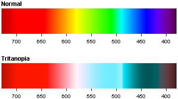
Tritanopia Color Spectrum
Normal and Tritanopia Color Spectrum

It can be observed that tritanopes usually have fewer problems in performing everyday tasks than do those with red-green dichromacy. Maybe this is because our society associates green with good/go and red with bad/stop, a pair of colors which accompanies us every day but a clear reason isn’t found yet by the researchers.

Tritan defects can not only be inherited but also acquired during one’s lifetime. In this case it even may be reversible and not permanent like an inherited color blindness. In the case of an acquired defect this is either evolving slowly for example simply through aging or coming instantly caused by a hard hit on your head.

  • Because the eye lens becomes less transparent with age, this can cause very light tritanomalous symptoms. Usually they are not serious enough for a positive diagnosis on color blindness.
  • Among alcoholics a higher incidence rate of tritanopia could be counted. Large quantities of alcohol resulted in poorer color discrimination in all spectra but with significantly more errors in the blue-yellow versus the red-green color range.
  • Mixtures of organic solvents even at low concentrations may also impair color vision. Errors were measured mainly in the blue-yellow color spectrum.
  • An injury through a hard hit to the front of back of your head may also cause blue-yellow color blindness. An example story can be found at Tritanopic after Head Injury.

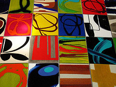
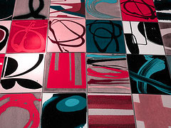
The two photographs below give you some impression what tritanopes see. On the left side the actual photograph is shown as it is seen by people with normal color vision. On the right side you see the tritan counterpart where you can spot how blue-yellow color blindness influences the view of colors.

Art Plates Art Plates - Tritanopia

Photograph taken by Ottmar LiebertSome rights reserved

Read more about Deuteranopia and Protanopia—the other two types of color blindness.

Further readings:
Opsin Genes, Cone Photopigments, Color Vision, and Color Blindness
Does Occupational Exposure to Organic Solvents Affect Colour Vision?
Wikipedia: Color Blindness

Related articles:
The Biology behind Red-Green Color Blindness
Colorblind Population